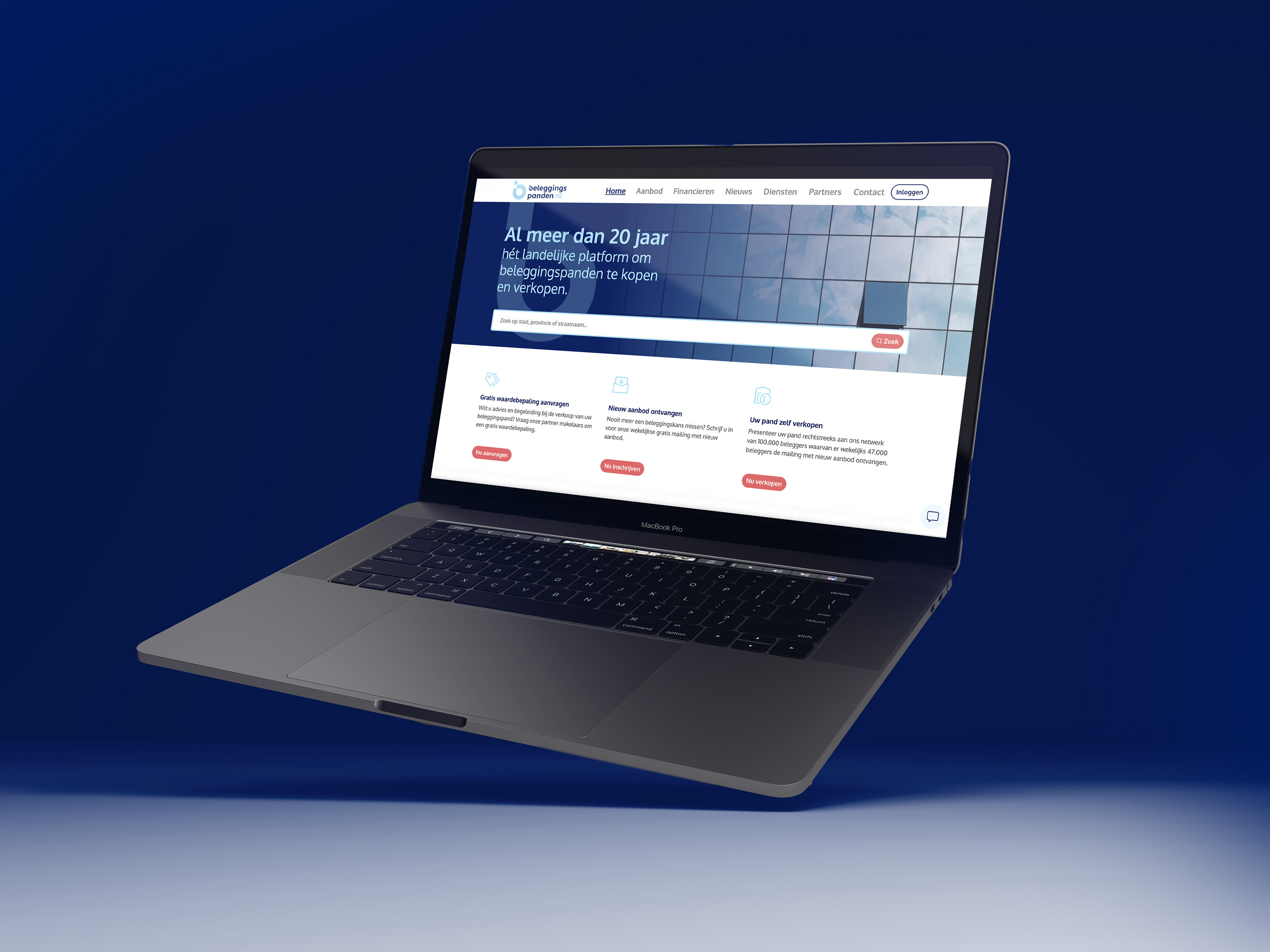
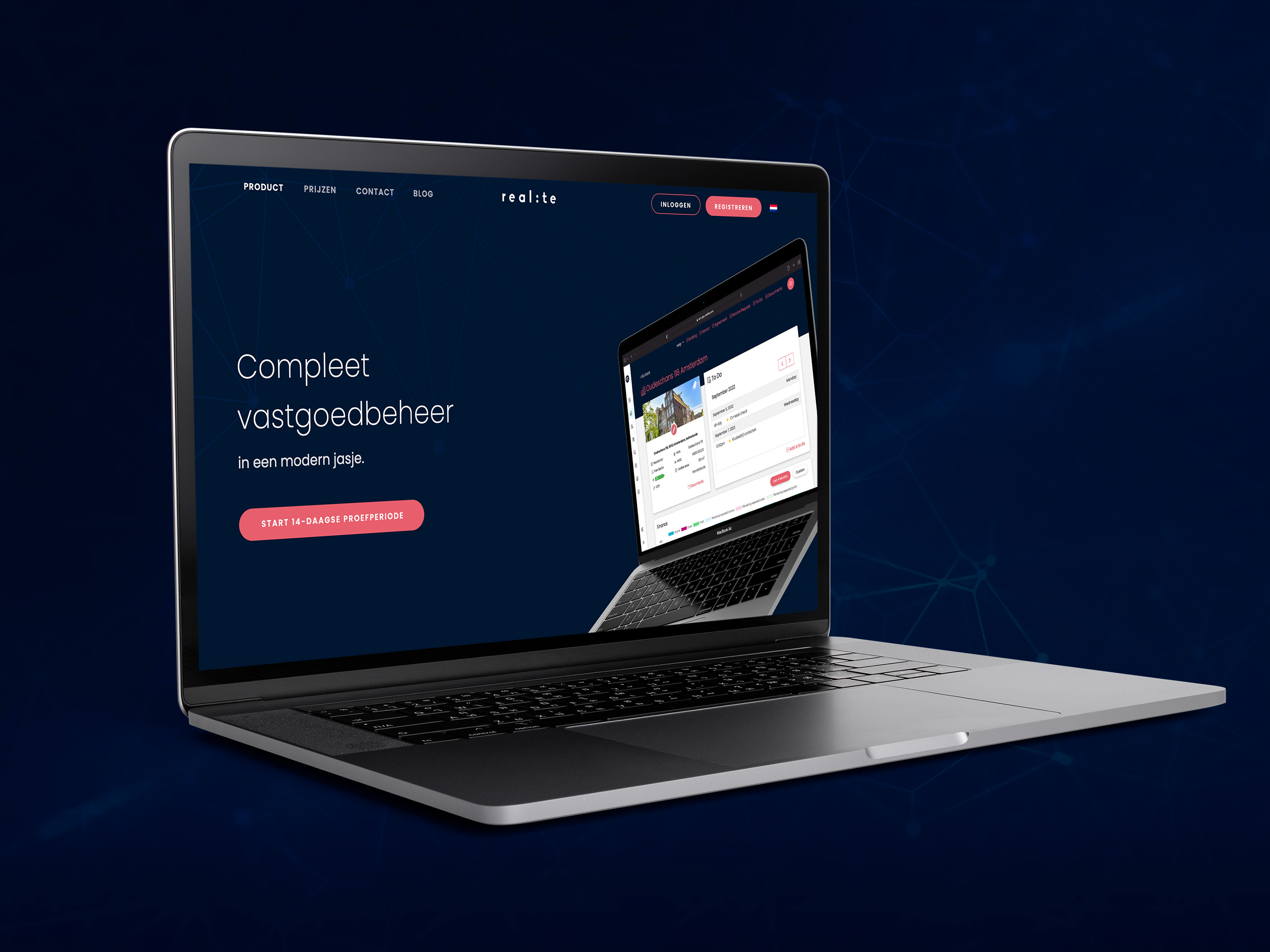
UI / UX of a webpage for an existing website. This page was created as a test page to generate more leads. The idea of the repeating single button "Contact us" in different blocks was consciously chosen and brought through the whole page, so a potential customer has a couple of opportunities to click on it and go down below to the contact form.
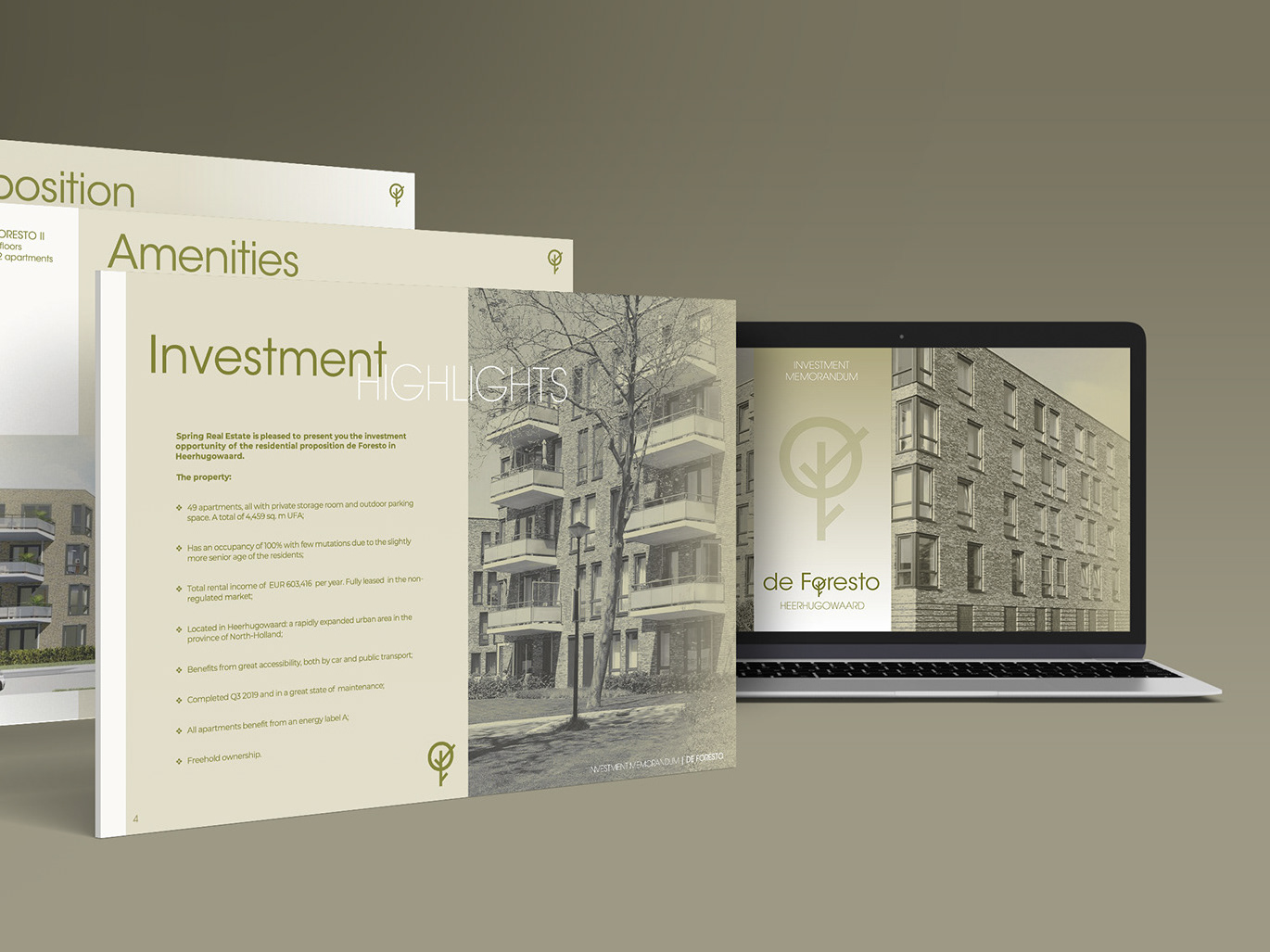
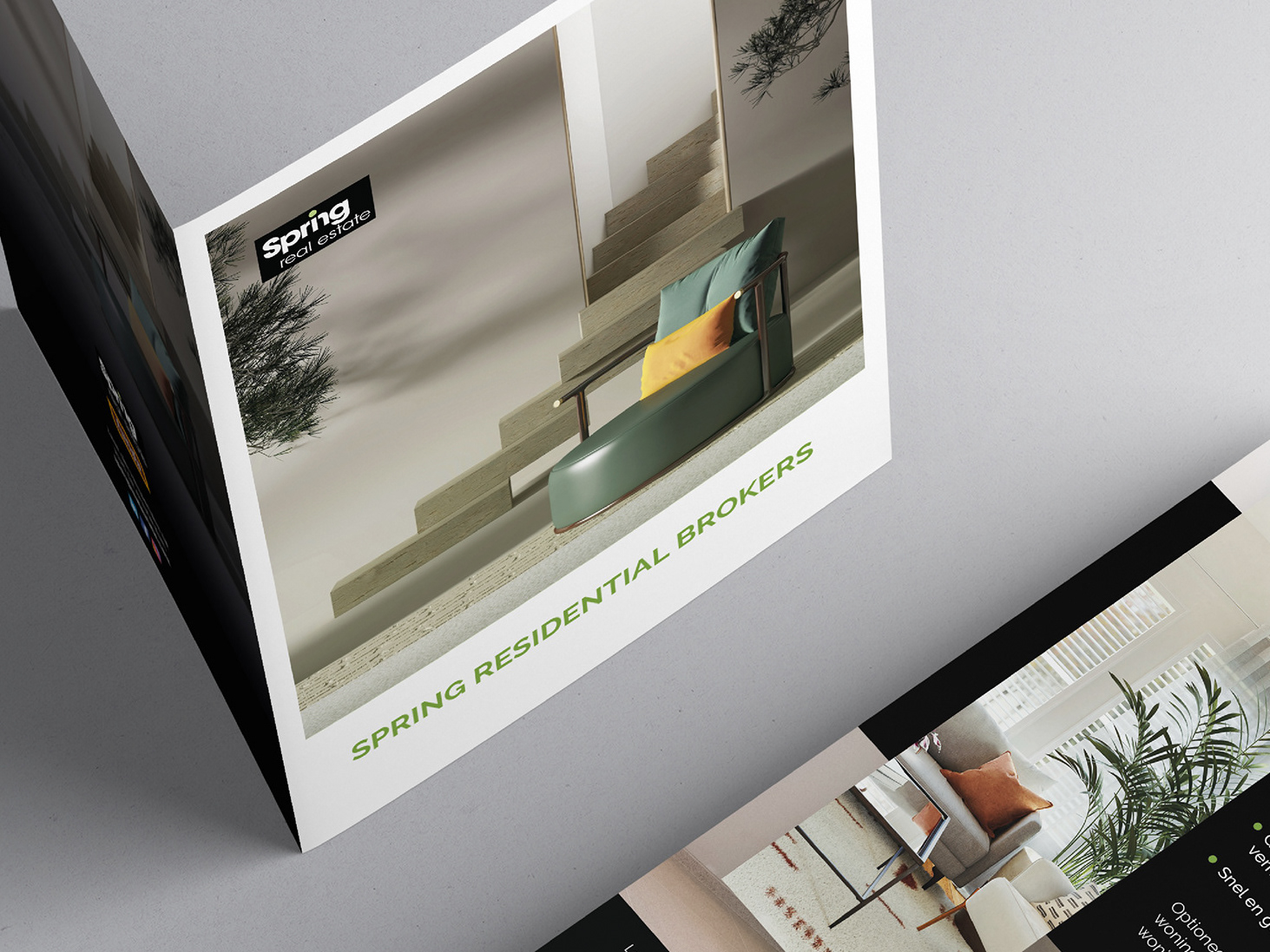
My customer wanted specifically one-page design. I was provided with the content and had to find the fitting images and style myself based on the existing brand of Spring Real Estate.
My customer wanted specifically one-page design. I was provided with the content and had to find the fitting images and style myself based on the existing brand of Spring Real Estate.
Click here to check the desktop version on Figma.
Click here to check the mobile version on Figma.
